

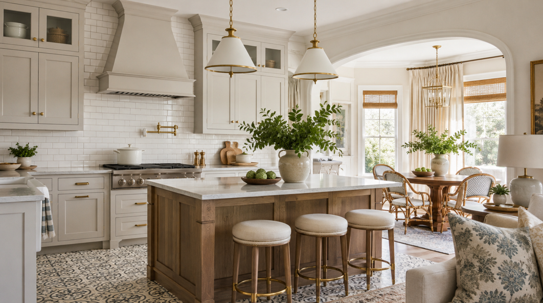
Many design trends fade quickly. Subway tile is different. Its clean shape, practical surface and ability to work with traditional, transitional and modern interiors have kept it relevant for generations. For homeowners in Ascension Parish, that versatility makes subway tile a dependable choice for kitchens, bathrooms, utility rooms and other high-use spaces.
The appeal is not limited to the familiar white brick layout. Today’s subway tile comes in a wide range of colours, sizes, finishes and materials. It can feel crisp and understated, warm and handcrafted, bold and graphic or quietly elegant, depending on how it is arranged and paired with grout, cabinetry and fixtures.
At Wholesale Flooring & Granite, homeowners can compare tile styles in person, explore coordinating flooring and countertop materials, and receive practical guidance from a local team with more than 18 years of experience. The warehouse showroom also makes it easier to evaluate colour, texture and scale before choosing a design.
This guide explores why subway tile remains a timeless option, which classic patterns work best in different rooms, how Louisiana humidity affects tile planning, and how Ascension Parish homeowners can create a look that feels lasting rather than dated.
Why Subway Tile Continues to Work
The classic subway tile is a rectangular wall tile with a simple, balanced proportion. The familiar 3-by-6-inch format remains popular, although longer, narrower and larger versions now offer more ways to shape the character of a room.
Its strength lies in visual flexibility. A plain rectangular tile does not compete heavily with cabinetry, countertops, lighting or hardware. Instead, it creates a structured background that can support many different styles. White tile with pale grout can brighten a compact kitchen. Cream tile with warm grout can soften a traditional bathroom. Deep green or navy tile can bring richness to a bar area or powder room without changing the basic geometry.
Subway tile also offers practical value. Ceramic and porcelain versions are easy to clean, resistant to everyday splashes and well suited to areas where moisture is part of daily life. That matters in kitchens and bathrooms, where painted drywall may show wear more quickly around sinks, cooktops and vanities.
The design also adapts over time. Cabinet hardware, wall colours and accessories can change while the tile remains relevant. For homeowners planning a long-term renovation, that adaptability can reduce the pressure to chase a short-lived trend.
A timeless result depends on more than selecting a familiar tile shape. Proportion, finish, grout colour and layout all influence whether the final installation feels classic, contemporary or highly decorative. Looking at full samples rather than a small online image helps reveal how the surface reflects light and how the tile relates to nearby materials.
Classic Running Bond: The Familiar Brick Pattern
Running bond, often called brick pattern, is the layout most people associate with subway tile. Each row is offset from the one below, creating a steady horizontal rhythm.
This pattern works especially well when the goal is to make a wall feel wider. In a narrow kitchen, the horizontal movement can visually extend the backsplash. In a bathroom, it can help a smaller vanity wall feel more open.
A traditional white tile with medium-grey grout creates clear definition between pieces. White or pale grout produces a softer, more continuous surface. Warm beige grout can work beautifully with cream tile, wood cabinetry and brass or bronze fixtures.
Running bond is forgiving because the pattern is familiar and balanced. It can support marble-look countertops, natural granite, painted cabinets or stained wood without drawing too much attention away from them. It is also a sensible choice for resale-focused renovations, as many buyers recognise it as clean and versatile.
For a more handcrafted appearance, consider a tile with slight variation in edge shape or glaze. These small irregularities catch the light and add depth while preserving the simplicity of the layout. A smooth, uniform tile creates a more precise and contemporary result.
Stacked Subway Tile for a Cleaner, Modern Look
A stacked layout aligns the vertical and horizontal grout joints rather than offsetting each row. The result is orderly, graphic and slightly more modern than running bond.
Horizontal stacking emphasises width and works well behind long kitchen counters. Vertical stacking draws the eye upward, making it useful in showers, behind vanities or on walls with tall ceilings. Vertical placement can also make a standard rectangular tile feel fresher without requiring a highly unusual product.
This layout suits homeowners who prefer clean lines and restrained decoration. It pairs particularly well with flat-panel cabinetry, simple hardware and solid-colour surfaces. A stacked white tile with matching grout creates a quiet grid, while contrasting grout turns the layout into a stronger design feature.
Precision matters because aligned grout lines reveal variations in wall surfaces and installation more clearly. Professional preparation helps create straight lines, consistent spacing and clean transitions at corners, outlets and cabinet edges.
Larger subway formats can make stacked layouts feel calmer by reducing the number of grout joints. Smaller formats create more pattern and texture. The best scale depends on the wall size and the other finishes in the room.
Herringbone: A Classic Pattern with More Movement
Herringbone uses rectangular tiles in an angled arrangement that creates a repeating zigzag effect. It has historic roots, but it still feels lively and current when used thoughtfully.
This pattern is effective as a focal point. It can add movement behind a range, inside a shower niche, above a bathroom vanity or on a feature wall. Using it throughout a large room creates a bolder result, while a limited application allows it to serve as a decorative accent.
White herringbone tile with pale grout feels subtle because the pattern appears through light and shadow. Dark grout creates sharper geometry. Coloured or textured tile increases the impact even further.
Because herringbone involves more cuts and alignment than a standard running bond, installation planning is important. The starting point affects how the pattern finishes at edges and corners. Symmetry can be especially valuable behind a cooker hood, mirror or vanity.
Homeowners who want a timeless look can keep the tile colour restrained and let the pattern provide interest. This creates visual detail without tying the room to a highly specific colour trend.
Basketweave and Other Traditional Arrangements
Basketweave uses rectangular pieces to create the appearance of interlocking blocks. It feels traditional and decorative, making it well suited to classic bathrooms, kitchen accents and smaller feature areas.
Straight lay offers a calmer alternative, with tiles aligned in a simple grid. A one-third offset can also work well with longer subway formats, creating a softer rhythm than a full stack while reducing the visual effect of slight tile curvature.
These layouts demonstrate how a simple rectangular tile can take on a very different character through pattern alone.
Choosing Ceramic, Porcelain or Natural Stone Tile
The material influences appearance, durability, maintenance and installation. Ceramic subway tile is widely used on walls because it offers many colours and glazes at an accessible price point. It works well for kitchen backsplashes, vanity walls and many shower applications when the product is rated for the intended use.
Porcelain is denser and generally offers excellent moisture resistance. It is worth considering for demanding wet areas, commercial settings or locations where extra durability is valuable. Porcelain can also reproduce the appearance of stone, concrete or handmade clay while offering consistent performance.
Natural stone subway tile, including marble, travertine and limestone, brings unique variation and texture. Every piece can differ slightly in veining and tone. That individuality creates a premium look, but natural stone often requires sealing and more careful maintenance in wet or stain-prone areas.
When comparing tile flooring and wall tile, it is important to check the product rating. A wall tile may not be suitable for floors, while many floor-rated tiles can also be used on walls if their weight and installation requirements are addressed. Slip resistance also matters for bathroom floors, entries and other areas exposed to water.
Seeing materials together can prevent mismatched undertones. A bright white tile may make a warm countertop appear more yellow, while a cream tile may look dull beside a cool grey surface. Bringing cabinet, countertop and paint samples into the selection process creates a more cohesive result.
Grout Colour Can Transform the Design
Grout can blend with the tile, outline the pattern or introduce contrast. Matching grout creates a quieter, more continuous surface, while grey or darker grout makes running bond, herringbone and stacked layouts more visible.
Warm grout colours work well with cream, beige, terracotta and wood tones. Cooler greys pair naturally with white, blue, green and charcoal palettes. Joint width matters too: narrow joints feel refined, while wider joints emphasise the pattern and can accommodate handmade tile variation.
In kitchens and bathrooms, stain-resistant grout products or suitable sealers can simplify maintenance. The best choice depends on the tile, location and expected use.
Designing for Louisiana Humidity and Moisture
Ascension Parish homes experience long periods of heat and high humidity. Kitchens and bathrooms add steam, splashes and condensation, which makes material selection and installation quality especially important.
Glazed ceramic and porcelain tile perform well in humid environments because their finished surfaces are easy to wipe and do not absorb everyday splashes readily. Properly installed tile can protect walls behind sinks, cooktops, showers and baths more effectively than paint alone.
The grout and the structure behind the tile also matter. In showers and other wet zones, a suitable waterproofing system belongs behind the finished surface. Tile and grout are not substitutes for proper moisture management. Professional preparation helps protect the wall assembly and reduce the risk of hidden water damage.
Ventilation remains valuable. An effective bathroom exhaust fan can help remove steam, while kitchen ventilation reduces moisture, grease and cooking residue. Air conditioning and sensible indoor humidity control also support the performance of cabinets, paint and other finishes.
Regular cleaning helps prevent mould and mildew from developing around grout lines, caulk joints and fixtures. Mild products and a soft brush are generally more suitable than harsh abrasive cleaning. Wiping wet areas and addressing plumbing leaks promptly also protect the full installation.
For floors, slip resistance deserves attention. Rainy weather, wet footwear and bathroom splashes can create slick conditions. Textured or matte finishes often provide more grip than highly polished surfaces, although the exact performance depends on the product.
Matching Subway Tile with Countertops and Cabinets
A successful tile design connects with the other fixed finishes in the room. The countertop often provides the best starting point because it may contain several colours or undertones.
When the countertop has bold movement, a simpler subway tile can create balance. White, cream, taupe or soft grey may allow the stone or engineered surface to remain the focal point. When the countertop is quiet and uniform, coloured or textured tile can add personality.
Painted white cabinets can pair with nearly any subway tile, but undertones still matter. Warm white cabinets may look better with cream or off-white tile, while cool white cabinets can suit brighter whites, blue-greys and crisp greens.
Wood cabinets bring warmth. Soft green, handmade white, muted blue and warm neutral tiles can complement oak, walnut or stained maple. Black or deep charcoal tile creates stronger contrast and can feel dramatic when balanced with good lighting.
Hardware and fixtures provide the finishing connection. Brass can warm up white or green tile, chrome supports a clean and classic look, and matte black adds definition. Repeating the same metal finish across taps, handles and lighting creates consistency, although mixed metals can work when one finish remains dominant.
Where Classic Tile Patterns Work Best
In kitchens, running bond and stacked layouts are practical choices for full backsplashes, while herringbone can create a focal panel behind the hob or range.
In bathrooms, subway tile can continue from the vanity to the shower for a coordinated look. Vertical stacking can make a low ceiling feel taller, and small herringbone sections work well in niches or behind mirrors.
Utility rooms benefit from easy-clean protection around sinks and counters. Fireplace surrounds and commercial interiors can also use classic rectangular tile when the product and installation system suit the setting.
How to Keep a Timeless Design from Feeling Plain
Timeless does not have to mean predictable. A wavy glaze, softly irregular edge or subtle tonal variation can add depth without making the room feel busy.
Muted greens, soft blues, warm taupes and earthy terracottas can also feel lasting when they connect with the home’s wider palette. Pattern provides another route: herringbone, vertical stack and one-third offset layouts create personality even with neutral tile.
The most balanced rooms usually focus on one or two points of interest. A strong pattern often benefits from quiet grout, while richly coloured tile can look best in a simple running bond.
Planning Your Ascension Parish Tile Project
Before selecting a tile, consider where it will be used, how much moisture it will face and how visible the pattern will be. Wall size, natural light, cabinet colour and countertop movement all influence the result.
Samples are valuable because glossy finishes can reflect light differently in a showroom and at home. Viewing several pieces together can also reveal colour variation that is not obvious in a single tile.
Allow enough material for cuts, pattern matching and future repairs. Detailed layouts generally create more waste than straight or running bond installations, so an installer can help calculate the right allowance. Trim pieces and exposed-edge finishes are also worth selecting before installation begins.
Wholesale pricing can open access to a broader range of quality materials while keeping the full renovation budget in view. Comparing tile, countertops, cabinets and flooring in one showroom also makes coordination more straightforward.
Create a Lasting Look with Classic Tile
Subway tile has remained popular because it offers a rare combination of practicality, flexibility and enduring style. Running bond creates a familiar foundation, stacked layouts feel clean and current, and herringbone or basketweave patterns introduce movement without abandoning classic proportions.
For Ascension Parish homeowners, ceramic and porcelain tile also offer valuable performance in Louisiana’s humid climate. With proper preparation, suitable grout and good ventilation, tile can provide an attractive, easy-care finish in kitchens, bathrooms and other active spaces.
The most successful design comes from seeing the full combination of tile, grout, countertop, cabinets and lighting before installation begins. Wholesale Flooring & Granite offers an established local team, a warehouse showroom and direct pricing to help homeowners compare options with confidence.
To discuss your project, request a free estimate or arrange a showroom visit, contact us and explore timeless tile choices for your Ascension Parish home.


